Case study
Atlantic Pacific
Business: Search & rescue and sea safety education charity
Work: Ongoing website support
Build: Squarespace
View website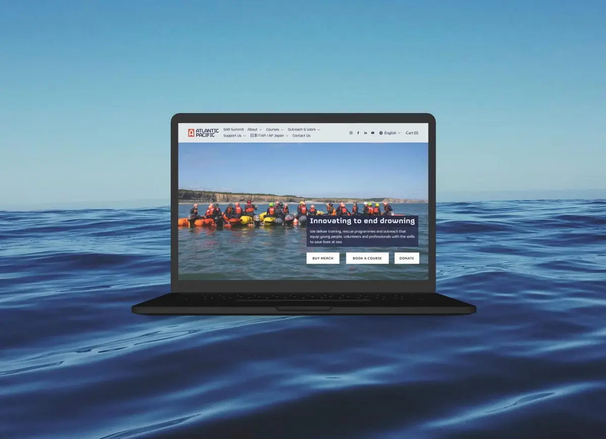
Atlantic Pacific International Rescue is an NGO working to end preventable drowning. They train search and rescue crews, teach sea safety to young people, and put lifeboats into the hands of communities that don't have them, from bases in London and Wales to a training centre in Kamaishi, Japan.
Jez Booker, Atlantic Pacific's marketing director, and I spoke in 2025 when they were in need of some website help. They had a conversion rate audit done by the Conversion Rate Experts (their name, not mine, but they really are the bees knees of CRO). They didn’t have the people-power to action any of the useful feedback provided by the audit which included conversion improvements and user testing results.
As part of Lumin Impact Projects, I was happy to assist this mission-led NGO with ongoing pro-bono website support.
The site had grown the way most charity sites do, bit by bit, over years. Courses, merchandise, community outreach and a wide programme of work were all squeezed onto the same few pages. Powerboat courses sat next to t-shirts. The navigation had ballooned. And the homepage never actually said what Atlantic Pacific does.
Jez confirmed none of the audit's recommendations had been touched yet, so I wasn't at risk of undoing anyone's work. My job was starting at the top of that list and working down.
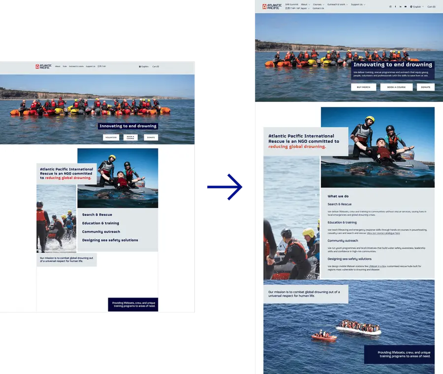
Month by month, the priorities shift, but the approach stays the same: find what's confusing people, fix it, move on to the next thing. So far that's included:
This is still very much in progress and a continuing project with Atlantic Pacific. There's more on the list: testimonials and trust signals, clearer pricing on individual course pages, better filtering for the course catalogue so people aren't scrolling through everything at once, and much more.
A bit tongue-and-cheek, but this was a big reason I worked with Atlantic Pacific on a pro-bono basis. They literally save lives. This was a constant thought and driver while doing seemingly simple things like making navbar changes and course slider tweaks.
Being able to put a few hours a month into that, so more of their energy goes into training and rescuing those lost at sea, rather than those lost on a confusing website. This is what Lumin Impact is for.
Find out more about Lumin Impact Projects here (and even apply for your organisation).
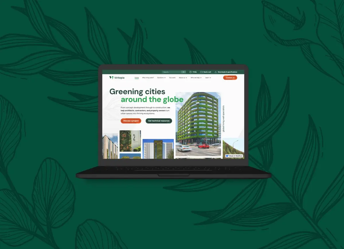
A strategic, low-carbon website revamp for the green-infrastructure leaders. The redesign yielded a 3x higher conversion rate, 2x higher Google Search position and 86% lower homepage carbon footprint.
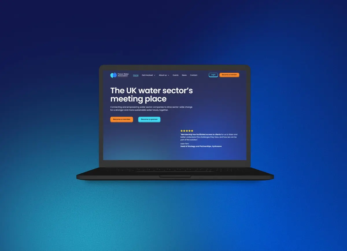
A low-carbon website redesign that modernised FWA’s digital presence. Better user experience, a gated members’ area, massively improved accessibility scores, and a 79% lower carbon footprint.